
🌴🌿 Feeling Lost in a Desk Review
Desk reviews often feel like a document jungle — and I so easily get lost.
I’m currently part of an evaluation team conducting a Country Programme Evaluation (CPE) for UNICEF. As you might guess, the number of documents we’re expected to read, understand, and synthesize is… immense.
Policies. Strategic plans. Country analyses. Reports. Internal notes. Stakeholder strategies. Guidance documents. And they come from multiple strategic levels: National, Regional, International, Organizational, UN partner agencies
The list goes on.
It’s easy to get lost — and even easier to lose sight of what really matters.
🔍 Why Traditional Desk Reviews Often Fail
In most teams, document reviews look something like transitory madness:
- Endless sticky notes 📝
- Annotated PDFs with cryptic highlights
- Overwhelming spreadsheets
- Scattered insights that never make it into the final analysis
- A fragmented picture, instead of a clear understanding
Sound familiar? It certainly was for me.
🧠 The Challenge: Making Sense of Complexity
Ever since I started developing my visual thinking muscles, my brain has taken on a new habit: spontaneous visual-storming to help me understand, figure out, place things in “its place”.
🗺️ Introducing: The Desk Review Mapping Visual
To bring clarity to the chaos, I created a visual to map and organize the key documents for the evaluation. How did my brain work around it?
Step 1: Define your dimensions
Ask yourself: what dimensions are relevant for understanding the context and focus of each document? Some possibilities:
- Thematic focus
- Methodology
- Chronology
- Geographical level
- Source or origin
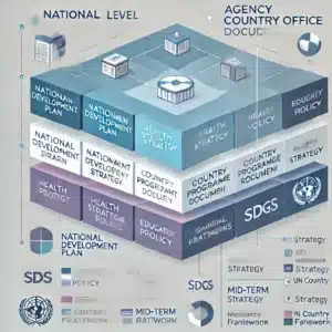
In this case, because the organization had to align with global strategies and national priorities, I used the two last ones: Geographic level (country or global), and Source or origin (government, UN, UNICEF and UNICEF Congo).
Because some documents were UN-wide strategies, others were specific to UNICEF at global level, others were country-specific from the government, and some framed UNICEF within the country.
Step 2: Choose your visual display
Among others, you could use a table, a matrix, or a flowchart… (I had seen a good example of a flowchart in a previous evaluability assessment).

But the problem with that example? I couldn’t spot a clear logic in how the documents were placed.
So instead, I chose a rectangular Venn diagram.

✨ What This Visual Is Doing
This diagram maps how national, contextual, and international frameworks (like UN strategies) interact — especially in relation to a country office (like UNICEF Congo). It shows:
- Alignment across levels: national, agency-specific, global
- Data sources and evaluations feeding into planning
- Interconnectedness of frameworks over time
It clearly mapped how the different origins of the documents and how layers intersected — and helped our team visualize where each group of documents sat.
We shared it. It worked. And it made our evaluation process stronger from the very beginning.
🎯 The Result
The visual map helped me highlight the key framing documents that mattered most. I managed to highlight the key frameworks from a scattered collection of documents for a more clear landscape of literature. And once you see the structure, you can feel confident that you’re not missing anything critical.
👥 Who This May Help
This approach could be useful to anyone who needs to make sense of many interconnected documents in complex systems, including people working in:
- Evaluation
- Research
- Program design
- Knowledge management
- Systematic literature reviews
- Policy analysis
If you’re dealing with information overload and need to clarify direction, this might be the tool for you.

Download Free Template
Want to Try It Yourself?
📥 If you want to use this visual in your report, you can download it here. It’s free, editable (Powerpoint), and ready for your next desk review.
Just wondering… can AI do better than this?
Just out of curiosity, I asked the mainstream AI tool to create a similar one (to improve my visual) and she came up with a pretty but too complicated detailed one and one too simple that didn’t have enough detail. Thank you, but as usual, I prefer mine 😂🤷🏼♀️😁.

✨ Final Notes
Sometimes thinking visually does not produce fancy, sophisticated results, but effective. This is one of those cases that show that the form is important in Dataviz, but the key is the content and the function. I love visualizing information. Thanks for reading! 🙂


