I wanted to talk today about a simple idea I use.
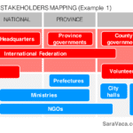
One thing I realize when I read evaluation ToRs or reports is how few of them have a nice Stakeholders Mapping, that really helps you understand who is involved in the program in an easy-to-absorb way.
In some cases, they describe the actors involved in the intervention in one/some paragraphs; best case scenario, they add a simple table with the name of the stakeholder on the left column and their role in the program on the right, but rarely something more sophisticated.
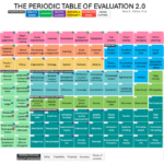
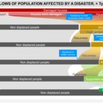
However, as usual, Data Visualization offers us easy-to-use ideas to display the similar information but, at the same time, providing with extra information embedded in a more visual format.
So, what I am doing in my reports lately, (both in the methodology report and the evaluation report, but it could also be used in ToRs too), is to represent them using this type of matrix:


Additionally, we could use the size of the box (such as in a bubble chart) or the color or hue to depict their relevance… or any other interesting variables.
As you can see, these are pretty simple ideas that can be done quite easily (these were all done in Powerpoint), that may bring some additional clarity for those who are not familiar with the program and the actors involved in it – but also sometimes to the ones that are.
Hope it is somehow useful. Thanks for stopping by! 🙂